How to make a navigation bar?
Read about how to create a navigation bar for your website & take your visitors on a journey.
When you’re creating a website, a navigation bar and the way you design your navigation bar is important. The design comes down to the end-user experience. If you design a great and easy to manage navigation bar, your visitors will be happy. If a user has a hard time navigating the navigation bar, they might very well leave your website and never return.
A visitor’s patience is minimal, so ensuring that they can find pages they’re looking for is incredibly important. Otherwise, if your visitors decide to exit your website, it will also affect, besides the amount of time on your page, your bounce rate and your conversion rate.
A navigation bar allows you the opportunity to prioritise the content you want visitors to read. It also enables you to take your visitor on a journey, from the most important pages at the top-left of the navigation menu to the lesser important pages at the top-right of the navigation menu.
This article will discuss making a navigation bar, and we will present all the important elements that make a navigation menu.

What is a navigation bar?
The purpose of a navigation bar is to help your user browse through your website effortlessly. A navigation bar is usually placed at the top of your website. On a mobile phone, the navigation bar is usually placed on your website’s top left and looks like a hamburger or, as typically referred to – a hamburger button.
The navigation menu consists of internal links; Links to all the pages that you want your visitors to read.
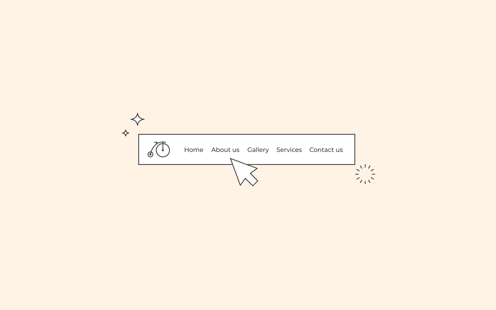
Example of a navigation bar
If we use one.com’s website, you can see that the navigation bar is placed at the top. You can also see that we have all our products that we sell in the navigation bar. In addition, we’ve also added articles that can facilitate the customer’s journey with our products.
The most common categories people use in a navigation bar are:
About us
Contact
Products
FAQ
But as shown with our example of one.com, you can choose how you want your navigation bar to look and what to include in your navigation bar.

Why is a navigation menu important?
A navigation menu is important because it’s there to facilitate the user’s search. If you didn’t have a navigation menu, how would you find everything that’s important on a website? Sure, you can link to some of your pages on the home page, but you can’t find everything that’s essential without a navigation menu.
Additionally, another key point of enabling a navigation menu is to ensure that your user stays on your website for a longer period of time and browses through your menu.
Elements to consider in the navigation bar
There are a few aspects to consider when designing your navigation menu. Aspects that are important and play a key role in the success of your website. As previously mentioned, a website without a working navigation menu can only lead to a negative experience.

The content and design of your navigation menu
The content of your website depends entirely on the type of website you run. The navigation menu is similar to a road marker that helps lead your user in the right direction. Thus, once you’ve established your website’s content, you can decide what you think should be included in your navigation menu. There is no blueprint; it all comes down to you and what you want to prioritise. However, you should limit your creative ideas in regards to the navigation menu. Keep the titles of your categories simple and easy to understand.
For example, it might be sufficient for a services company to have its website navigation on the top-level menu. However, the same style would be a cluttered mess for an e-commerce website, where the top product categories would help guide the user to find what they’re looking for.
Samsung does a good job with its navigation menu. Despite the various products they offer, their navigation bar just shaves it down to their top four product categories on the left. Other subjects, for example, the history of the company, are on the right.
– Hypertext
Make sure that the text of your content and your hypertext are differentiated. Your user needs to be aware and see the difference between hypertext and actual text on a page.
– Colours
Make sure that your navigation bar stands out from the rest of the page. Differentiate between your main content and your navigation menu using colours, fonts and other types of elements such as using white space.
Use links, not buttons, in your navigation menu
Nowadays, several websites’ use links in the navigation menu and not buttons. In the past, even though the buttons helped the links stand out on the page, they were not search engine friendly. On top of that, they’re less accessible for the visually impaired.
Save the buttons for your calls to actions.
Hide your search field
A recent trend has emerged where you can hide the search input field until it’s needed. This is to reduce the visual complexity and is a great trend to implement for websites’ that are not dependent on the search field.
Sticky navigation bar
A sticky navigation bar is a feature that can be great to implement. If you want to see an example of how it works, you can check our page, and you will notice that as you scroll down this article, the one.com navigation bar follows along with you.
A sticky navigation bar allows you to hop to different sections without the hassle of having to scroll up. You can also implement a link with the text ‘jump to the top of the page’ to follow you as you read if you don’t want the navigation bar to cover your screen.

Consider the footer
The footer of a website is also a type of navigation bar. This is a place where you can add extra information that you don’t want to include in your navigation menu or don’t have space for. A footer is also a place where you can repeat information. For example, once the user has reached the end of the page, they can just click on the next item stated in the footer to read.
