What to check before launching my website?
8 things you should check before publishing
Creating a website is fun and challenging, but it should also be rewarding. Once you press publish, your website is accessible to everyone on the internet, and you want it to be free from mistakes. You do not want to launch your website after working hard to build it, and later find out that there are still a few things you haven’t thought of.
In this case, we’ve compiled a checklist of 8 points for you to review before hitting publish.
Quick Scan Checklist
- Be consistent with colours and fonts.
- Make sure your website is easy to navigate.
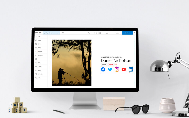
- Add social media icons.
- Include call to actions (CTA).
- Proofread your content.
- Check functionality from the user’s point of view.
- Add a favicon.
- Make sure your website is secure.
Have you not started creating your website yet? Why not go ahead and select one of our hosting plans?
Your checklist before launching a website; in-depth
In each of the points below, we will discuss the ins and outs of what you need to pay attention to, before publishing your website.
1. Be consistent with colours and fonts
Colours are a useful way to stir your visitors’ emotions and have them respond to your call to actions. Plus, if you choose distinctive colours for your website, your visitors might start to associate those colours with your brand.
In the same way, it is also important to pick a font which is easy to read as this is key for the presentation of your website. For instance, choose a set size and be consistent with your headings, subheadings and body. This allows your reader to comprehend the text better.
2. Make sure your website is easy to navigate
Making your website easy to navigate is essential for providing great user experience. Good navigation makes it more likely visitors will stay on your website, rather than feeling frustrated and leaving because they cannot find what they’re looking for.
Additionally, keeping your customers happy by adding links to the right pages and having a good website menu is key. However, you should also make sure any links you are using are not broken.
3. Add social media icons
In this day and age, social media presence is an important factor that all businesses should take into consideration. If you don’t already have social media pages such as Facebook and Instagram, we suggest creating them before making your website go live. It’s a great way to make visitors on your website aware of your social media pages. Most businesses tend to use social media icons in the header or footer of the website.

4. CTAs
A call to action (CTA) is a button or link which is designed to prompt an immediate reaction or encourage visitors to perform an action – for example, to book an appointment. By strategically placing CTAs, you can guide your visitors through a journey, which impacts your conversion rates. This could mean buying your products, signing them up to your website, subscribing to online courses, or even a button for a free trial.
Most importantly, you must check you have CTAs on your website. Without the CTA, your visitor may not realise what you are offering, or where to go next. As a result, they may end up leaving your website if they cannot find what they are looking for.
5. Proofread
There is nothing more deterring than going onto a website and encountering typos, grammatical errors and misspellings. Therefore, immediately giving your brand a bad image. Thus, proofreading your content will prevent you from making such mistakes and consequently, give your customers a bad experience.
6. Check functionality from the user point of view
You should always check your website from a users’ point of view. By allowing your users to navigate through your website easily, you are creating a user-friendly environment. For example, If you have a lot of pages, you could, add a search bar to your site, to allow your users to find what they are looking for easily. With this purpose in mind, try putting yourself in your visitors’ shoes and see how easy you find your website to navigate through. If you are finding any difficulties, then they probably will too. Additionally, you should check your website speed and responsiveness, which are other factors that contribute to the user experience. You can use tools such as, Think with Google for this.

7. Favicon
A favicon is a small icon that represents your website, you can find these in the address bar of your web browser. However, they can also be used in bookmarks. You can see googles famous ‘G’ favicon below.

Besides, it’s a quick way for the user to identify your website, should they have multiple tabs open or via bookmarks.
8. Website Security
Website Security is not only important for your company information, but it helps protect your customers against hackers and cyber-thieves from stealing their data.
At one.com, all of our hosting plans come with an SSL certificate (Secure Sockets Layer certificate). In other words, it allows your website to authenticate itself as genuine and encrypts your data, making it difficult for an attacker to retrieve your data, such as credit cards. Also, at one.com once your subscription is activated, your SSL certificate will be too. This can sometimes take 24 hours.
To sum up, once you have a checked everything on this list, you’re ready to publish your website and receive traffic.
After you’ve successfully launched your website, you may be interested in learning more about what to do after your website is published.
