What is a call to action?
A call to action button can convert your visitors into customers
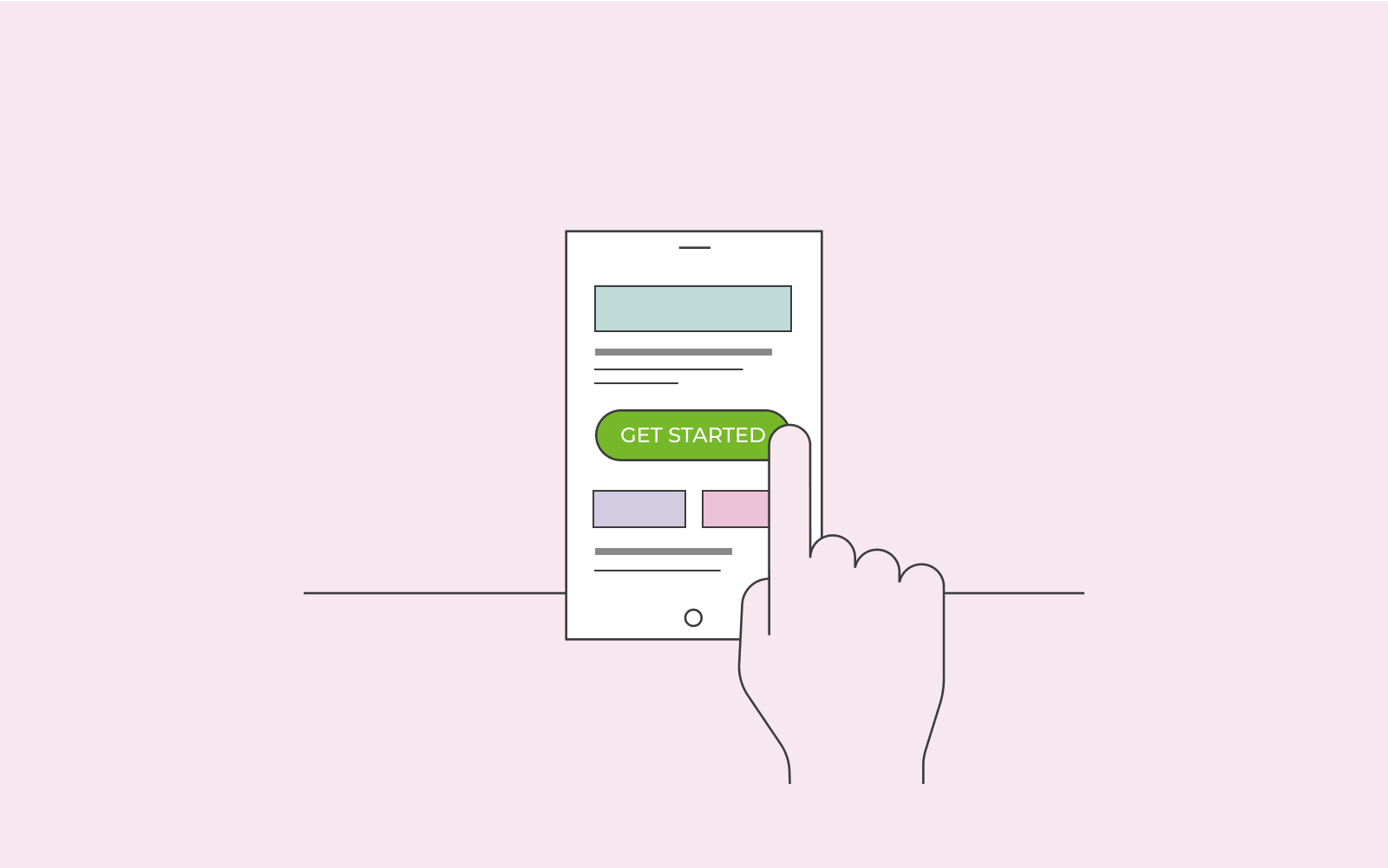
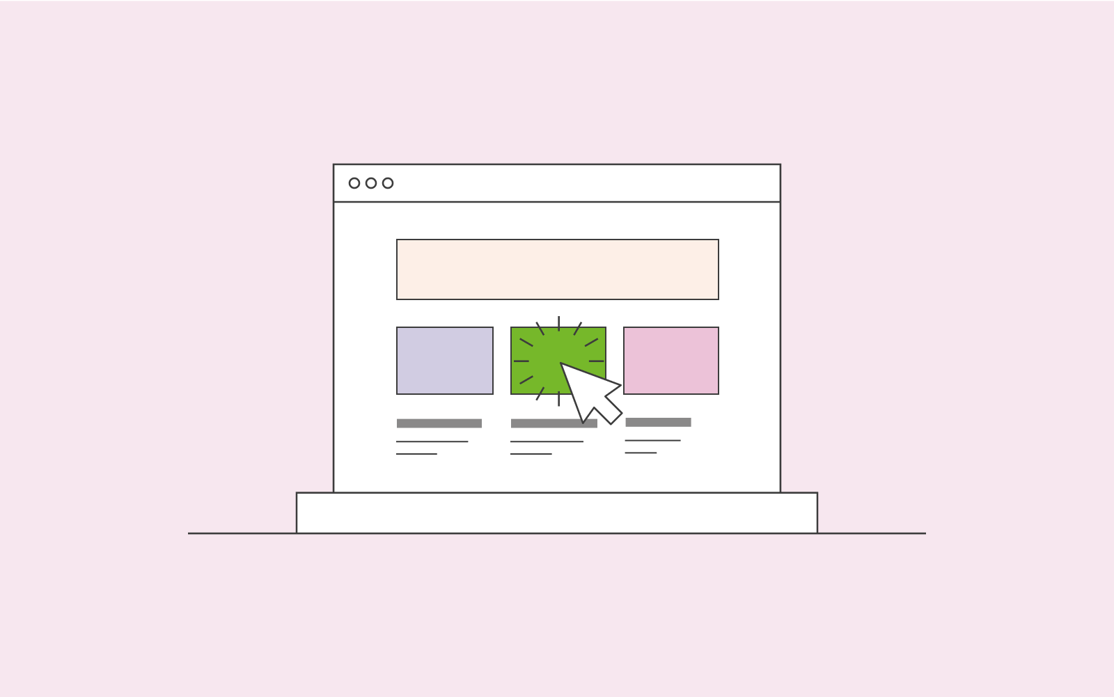
Call to action, also called CTA, is used a lot in marketing. A call to action means instructing a customer to do something. Thus, a call to action button is a great way to convert your visitors into customers.
Brief Summary
A Call to Action (CTA) encourages someone to take a specific action, such as clicking a button, filling out a form, or making a purchase. CTAs are often used in emails, websites and ads.
The first thing you should do is to consider what the end goal is with your business. For example, is it to convert visitors to customers, generate leads, or is it to create a great email list? Once you know your end goal, you know what to focus your call to action on.

On this page
Call to action examples
Call to action buttons can look different both in the visual but also in the text. For example, if you work at a travel agency, you might have a cool summer destination that’s on offer at your company. When people click on the promotion to read more about it, you can have a call to action button that states Book now. You’re instructing and encouraging the customer to book the travel to that destination. CTA’s are often very successful because a customer might need just one last push after reading an article about the destination. They’re intrigued; they want to travel to the country, and by the time they’ve finished reading the article, they see a CTA that can really seal the deal.
Keep in mind that a call to action is not just to encourage a customer to purchase a product or service. A CTA can be used for various things.
If you offer courses at your company, you can offer a course for free for people who sign up. You can have a call to action button that states Subscribe now. This is to entice your users to subscribe, which is a great win for you because you’ll have their email addresses for future use.
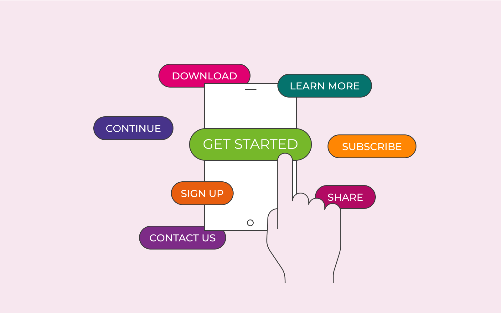
Some call to action examples are:
– Shop now
– Contact
– Sign up
– Start your free trial
– Reserve your seat
– Try it for free
– Sign up for 20% per cent off
– Get started today
These are only a few, but you can have anything you want there to entice and encourage people to take action.
Call to action marketing ideas
You can do a lot with CTA’s. Below we’ve shared some marketing ideas to really perfect your CTA and make it work to your advantage.

Make your offer clear
Make sure that your call to action button is very clear. Don’t mislead the customer. For example, if your call to action button states Start your free trial, make sure you’ve linked a page that leads the customer to their free trial. Don’t have hidden costs while the customer is signing up – it should be completely free as you’ve stated on your CTA.
Short CTA’s
Use a short and precise text on your call to action button. You want to really gear the customer into taking action with a word or two. The call to action should be the punchline and seal the deal.
Match all your CTA’s
Ensure that your call to action on advertisements matches your call to action on your website. If we go back to our Subscribe now example, if you have Subscribe now on your website, your ad should not say Watch the video now. Your CTA’s should match each other and have one end goal: to encourage the customer to subscribe.

Colours
Make sure that the colours of your CTA stand out. Always go for bright colours, but test out a few different colours and track which one works best for your visitors if you’re not convinced. Instead of having a huge CTA forced on the customer, try bright colours to stand out instead.
