How to improve your website’s end user experience?
Read our 3 great tips that will elevate your UX.
Your visitors are an essential key to growing your business and brand. Subsequently, your user’s experience should be at the forefront of your mind.
The most significant thing you can do to improve your website’s end user experience is to think like your user. Browse through your website in order to notice features that are not working or aspects that you believe a user might find confusing or complicated. Always have your user’s impression in mind when designing your product. You must ensure that your website is accessible, understandable, and valuable. Your website is a huge part (if not the most significant) part of your business, and you want to make sure that you are leaving a great first impression.
What is website UX?
User experience, also commonly known as UX, focuses on the user and the user’s experience when designing a website or product. The design team (or it could be just one person) has it as a goal to design a website that leaves the user with a great first impression. AI’s in website creators are also developed to create websites with good UX.
The objective of a user experience design is to consider the user. Focusing on how a user might experience a product, for example, is important. The users’ impression of your website or product is vital and useful information. Use the information to think of how you can improve the end user experience. Ask questions such as:
- Is the purpose of the product easy to understand?
- Does the user know how to handle the product?
- How would the user approach the product their first time?
With the user experience at the forefront, many more questions can be asked when designing a website or product.
To establish a good user experience, the design process should encompass all aspects of a website, from searching for an item to animations that pop up. For example, if you’re selling a product, make it easy for your user to add that said product to their cart. It’s all about accessibility, simplicity, and attractive design.
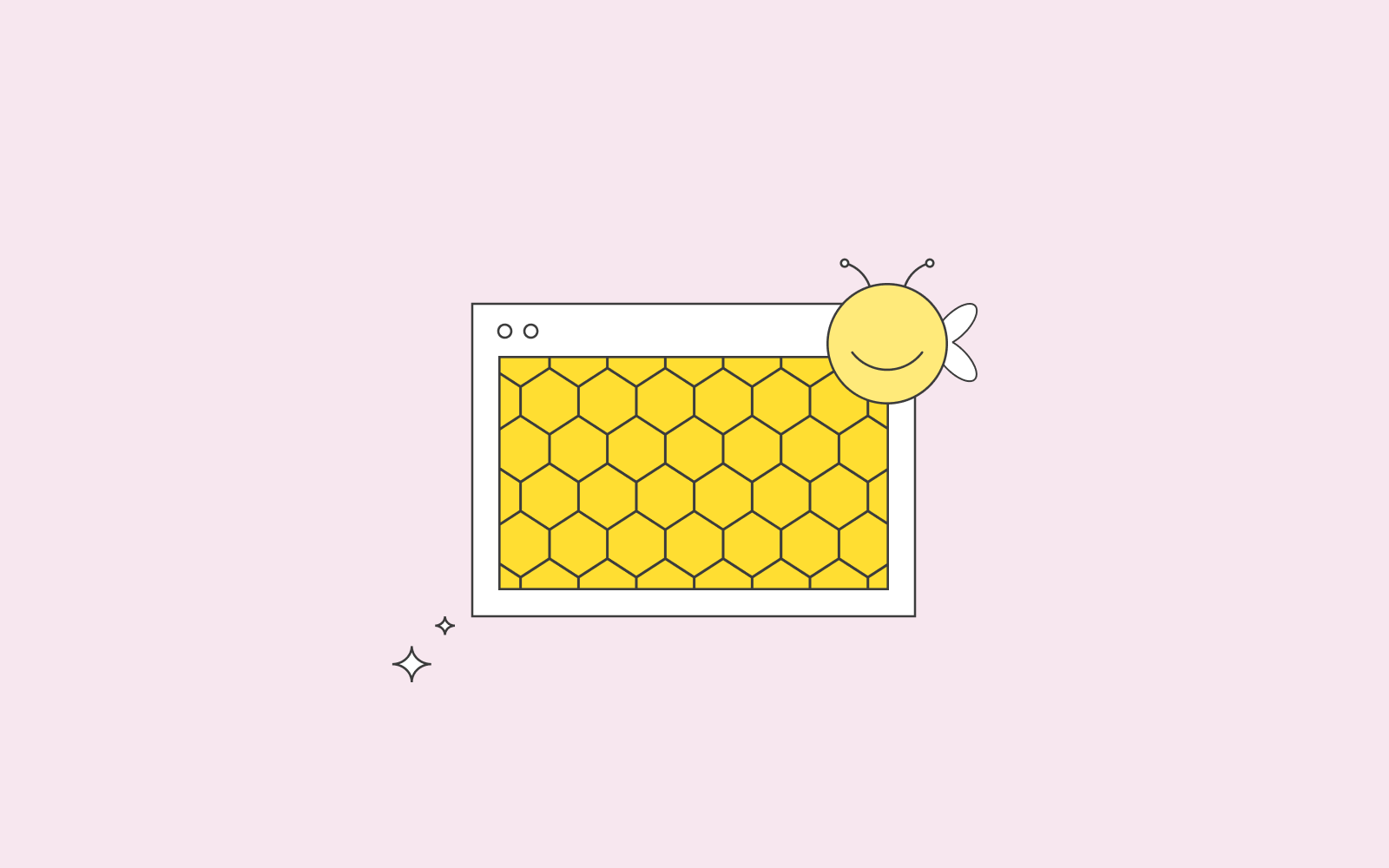
UX design has a honey combe that designers consider. This honey combe was developed by Peter Morville and include these seven key points:
- Useful
Is the design useful? Will the user find it helpful? For example, does the user find the search bar useful? Every component in the design must be considered when asking this question.
- Usable
Is the design usable? Can the user use the product(s) to their advantage?
- Findable
Is it easy for the user to find what they are looking for?
- Credible
Does the user find the product or product information credible?
- Accessible
Does the user find it easy to access the said product? For example, can the user use the search bar effortlessly?
- Desirable
Is the product desirable? Does it make the user want to purchase the said product? Is it catching the user’s eyes?
- Valuable
And last but not least, is the product valuable? Does the user see the value in the said product?
This honey combe incorporates points that you can use to improve the end user experience of a website. In addition, you can use the honey combe as a way to prioritise the aspects that are most relevant for the end user experience. For example, is it more important to have an accessible product or a desirable one? The key is to figure out the user’s intent. If you see a product for the first time, how will you react to said product, and what will most likely catch your attention? How accessible the product is or how desirable?
Today, a few things are essential to consider, time optimisation, people’s short attention span, and the norm that is instant gratification. We don’t want to endlessly scroll a website to find the information we are looking for, and we don’t want to wait for a page to load. We want, as users, ease of use.
What makes a good user experience?
Have you ever clicked on a website that’s taking time to load, and you feel like you’re wasting time? And have you ever clicked on a website with a loader that makes you feel part of the process? This is an example of user experience optimisation; to make the user feel engaged while the page is loading.
Let’s provide another example. Have you ever decided to use a product on a website that has left you feeling agitated because it was not working? That is a result of bad user experience. Another example of bad UX design is when the user is overwhelmed with information. If the user feels like they can’t comprehend the information because it’s all a cluster and overbearing, you need to optimise the user experience.
3 tips on user experience optimisation
There are several ways to make a website better; to improve end user experience. We have written down some great tips on how to improve end user experience and ensure repeat customers.
A good UX design does not overcrowd or overbear
You should have as much white space on your website as you can. Don’t overcrowd your pages with text and animation. You don’t want to confuse the user with too much information. Improve your website design by keeping it clean and by only having relevant content. A good user experience design guides the user through vital information, for example, by using hierarchies without overwhelming. For example, use bullet points to make your content clearer. Make the information you have provided useful. Also, headlines are a good way for your users to navigate through all the information.
Every aspect of the website design should be considered, from images to text fonts and colours. Images (when compressed) are a useful add-on. A picture is worth a thousand words, and this applies to UX design as well. An image helps break-off long pieces of content, tells a more precise story and makes it a perfect experience for your user.
Speed makes good user experience
Nothing contributes to bad user experience as a website that takes too long to load. User experience optimisation should include speed optimisation. Many times, users don’t even wait for the website to finish loading. They exit as soon as they realise that the loading time is too long. Think of situations where users want a quick solution to their problem; good UX design should allow the information to load in under 2 seconds to avoid the user bouncing from the website out of frustration.
One example of speed optimisation contributing to good UX design is optimised images on your website. Images are usually culprits; make sure that you compress all your images before uploading them. Read this helpful article about how to speed up your WordPress website.
While on the topic of speed, make sure that you catch your 404s. There is nothing as lousy as waiting for a page to load only to take you to an error message. A 404 leaves a wrong impression; the impression might be that your website is not legit.
Call to action makes good user experience
A good call to action can do wonders. Place your call to action at the most optimal place and let your user find the product they are looking for without any hassle. Use attractive colours, consider the wording, and think clearly about the design of the CTA. You want to draw in your users and improve their experience.
However, make sure to separate your call to actions. Remember to not overcrowd and overbear your user with too much information.
Mobile-friendly UX design
Today, we all use our mobile phones to look for information and when buying products and services. Mobile-friendly websites contribute to good user experience. When designing your website or product, keep your user’s impression on your mind. How would they like to perceive your website on their smart devices? Ensure easy navigation for your user to improve their experience.
Ensure that your user experiences your website on their smart devices the same way as they would on a computer.
UX design is worth your time!
These tips will help you minimise the risk of users bouncing. Consider implementing our tips to decrease your bounce rate if you find it an issue. With a decrease in bounce rate, you’ll most likely increase your conversion rate. If your user decides to stay on your website and browse, your products will most likely catch their attention, and they will be encouraged to purchase said products.
This leads us to; improvement of your brand. If your visitors are happy with the user experience design and are pleased with the product or service they have purchased from your website, it will lead to repeat customers. Satisfied repeat customers are the ultimate goal as they usually progress to lifetime customers.
In summary, make sure that your user browses through your website, understands what they are looking for, purchases the product or service without any hassle (or reads the information they are looking for), and leaves satisfied. This is a good user experience.
